 Skip to content

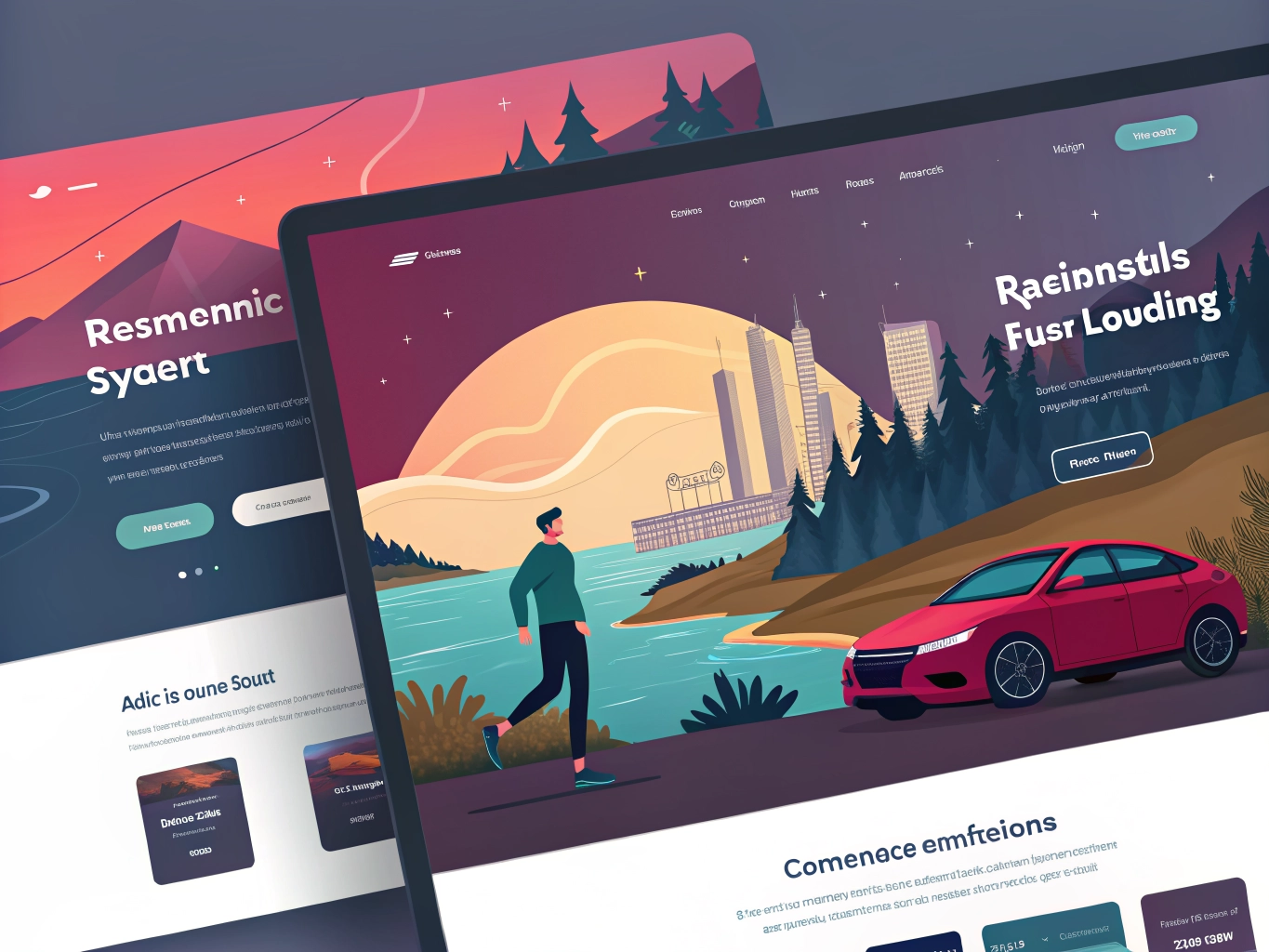
If you look back at the websites of the early 2020s, a distinct pattern emerges: rows of identical SaaS landing pages, predictable monochrome grids, and cookie-cutter templates. We reached a point of “peak design uniformity.”
But this year, the pendulum has officially swung back.
The web landscape has moved past the initial chaos of the AI hype cycle. We are no longer trying to force conversational bots into every sidebar or relying on generic, AI-generated stock layouts. Instead, web design has matured into a balance of hyper-functional utility and deep, tactile storytelling.
Whether you are looking to overhaul your brand’s digital footprint or building a platform from scratch, these are the core pillars defining successful websites this year.
1. The Architecture of Intent: Real-Time Personalization
Websites are no longer static digital brochures that display the exact same text to every visitor. They have become fluid environments that adapt based on user intent and behavior.
- Dynamic Component Layouts: Modern content management systems (CMS) use lightweight, privacy-compliant data layers to restructure page hierarchies in real time. If a visitor arrives via a high-level educational search query, the hero section surfaces introductory articles. If they arrive with high transactional intent, the site instantly prioritizes pricing and product feature grids.
- Intelligent Assistive Search: The standard, rigid search bar is dead. Search functionality is now powered by natural language understanding, allowing users to type complex, conversational queries (e.g., “Show me a mid-weight jacket that works for rainy commutes but doesn’t look like hiking gear”) and receive curated, contextual results instantly.
2. The Unforgiving Performance Frontier
With mobile devices driving nearly 60% of global web traffic, speed is no longer just a technical metric—it is the single highest-stakes ranking and conversion factor.
- The 2.5-Second Threshold: Search engines and AI discovery platforms heavily penalize slow-loading sites. Your Largest Contentful Paint (LCP)—the time it takes for the main content of a page to render—must clock in under 2.5 seconds on a standard mobile network to remain competitive.
- Next-Gen Asset Optimization: To achieve this speed without sacrificing rich visuals, modern workflows rely on performance-first engineering:
- WebM & AV1 Video: Replacing heavy GIFs and old MP4 formats with highly compressed, hardware-accelerated video containers.
- Fluid SVG Masking: Using scalable vector shapes instead of massive PNG files to create interesting layout dividers and organic borders.
- Variable Fonts: Loading a single, lightweight font file that dynamically handles multiple weights and slants, slashing server requests.
3. Micro-Interactions and Kinetic Typography
Static text and dead buttons feel broken to modern users. The current trend uses purposeful motion to guide a user’s attention through a narrative, rather than just adding superficial flash.
- Tactile Micro-Feedback: When a user hovers over a primary call-to-action (CTA), the button doesn’t just change color; it subtly morphs, expands, or provides immediate, fluid feedback. When a multi-step form is completed, checkmarks animate naturally. On mobile web apps, these transitions are paired with subtle haptic feedback API calls to make the glass screen feel tangible.
- Typography as the Hero: Because heavy imagery bogs down load times, oversized headlines and animated kinetic typography have taken over the hero fold. Bold, beautifully typeset text communicates a brand’s core message faster and more clearly than any background video ever could.
4. The Great Aesthetic Split: Where Do You Fit?
Visually, the web has fractured into two dominant, opposing design directions. Brands are completely rejecting sterile, corporate gray-and-blue color schemes in favor of distinct identity.
| Aesthetic | Key Elements | Ideal Brand Alignment |
| Nature Distilled | Muted, earthy tones (clays, terracottas, sage greens, and wood grains), warm off-white lighting, organic layouts, typewriter fonts, and expansive whitespace. Inspired by palettes like Pantone’s Cloud Dancer. | Sustainability initiatives, wellness and mental health spaces, high-end editorial journals, boutique hospitality, and artisanal consumer goods. |
| Tactile Maximalism | Symmetrical, rigid layouts intentionally broken up by sharp geometric forms, bold neon accents, 3D layered glassmorphism elements, grain overlays, and “Neo-Brutalist” functional elements. | Creative portfolios, tech startups, software engineering tools, music/entertainment events, and streetwear or youth culture brands. |
5. Restrained 3D and “Scrollytelling”
The days of forcing users into heavy, fully immersive 3D WebGL sandboxes that overheat laptops and lag on mobile devices are over. Today, 3D is used with extreme discipline.
Instead of rendering a whole virtual environment, web teams compress high-fidelity 3D assets solely for interactive product showcases. A user can smoothly rotate a piece of furniture, change its fabric textures, or inspect the ports on an electronic device directly from the landing page.
This is seamlessly integrated with scrollytelling—a technique where the simple act of scrolling down a page triggers choreographed visual transitions. As the user moves down, text fades into view right alongside the specific feature being highlighted on the 3D model, turning a standard product spec sheet into a cinematic, step-by-step story.
The Takeaway for Brands:
Success this year requires picking a clear side. The middle ground—the safe, sterile, generic template—is dead zone territory. Whether you lean into the quiet minimalism of Nature Distilled or the loud utility of Tactile Maximalism, your platform must lead with unmistakable character, flawless mobile optimization, and instantaneous loading speeds.